
I have a friend looking for subsidized housing in and around Vancouver. BC Housing keeps listings at http://www.bchousing.org/Options/Subsidized_Housing/Listings but the data is all shackled up in PDF files as simple lists. There's no easy way to visualize where these properties are located within the city, and no easy way to search/filter for places that, for example, allow pets.
So, in a fit of insomnia, I decided to try a late night nerd project: creating a handy map of this data from a spreadsheet. Here it is in all of its glory. ;)
Step 1: Getting your data into Google Sheets
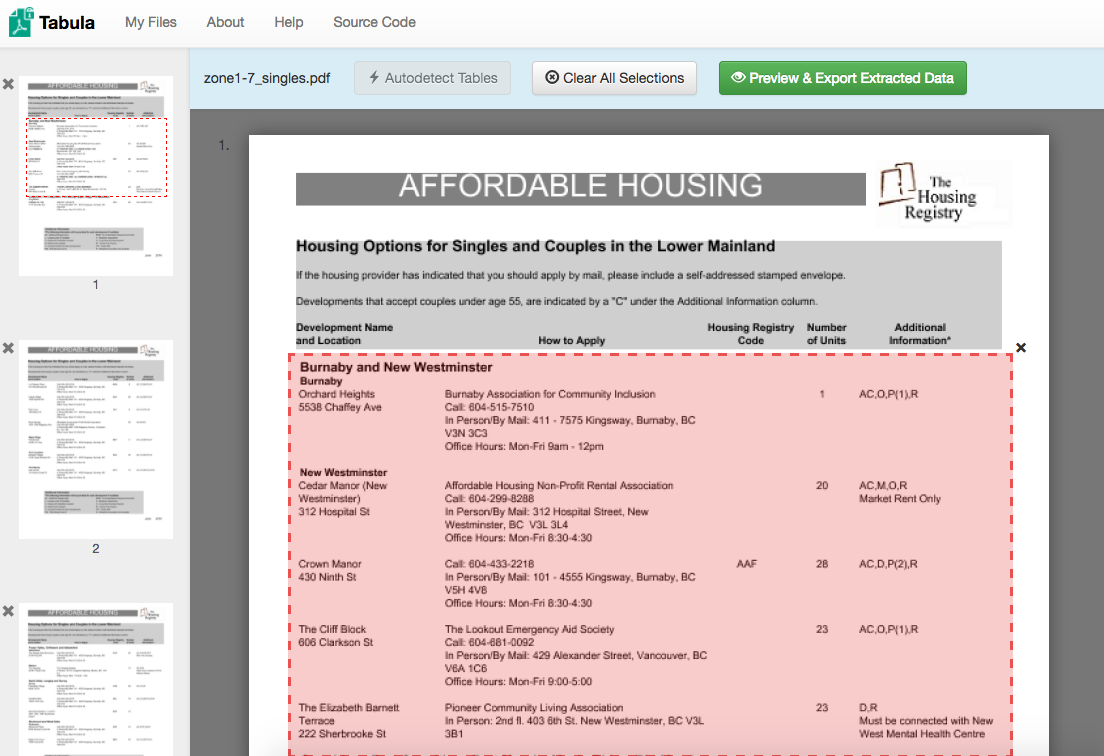
If you're exceedingly fortunate, your data will be in some sort of nice, machine-readable CSV format and you simply import it and off you go. Or, you could be exceedingly unfortunate like me, and have all your data encoded in a horrifying pseudo-tabular PDF file. Whee! :P
So I'll freely admit, I ended up totally cheating here and spent 2 hours on a massive copy/paste job. :P But before I resorted to that, I did explore some other options like PDF Parser (a Composer-friendly PHP library which has API functions for converting PDFs to text, and hey they use Drupal! :)) as well as Tabula, which lets you draw boundary boxes around tabular data in a PDF and it will attempt to automatically convert them to CSV for you (it got really close, and presumably in a correctly formatted PDF would've worked great).
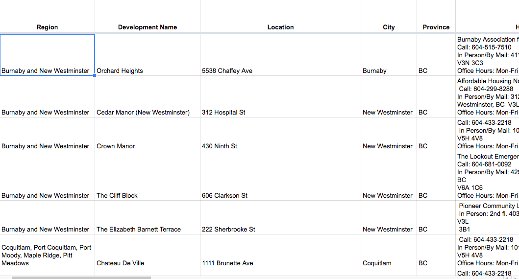
Anyway, so step 1 is you need a Google Sheet with address data in it. Here's a copy of mine: https://docs.google.com/spreadsheets/d/1PZ4iGDz8IrZ8HvTESb8JSS3dtcZ9FjvM... More or less, I just created dedicated columns for all the things in the PDF, with two exceptions:
- In the PDF, "Development name and location" are one field; I've split them apart so that the development name part (e.g. Orchard Heights) and the address part (e.g. 5538 Chaffey Ave) are separate.
- I've also added columns for city and province, to help Google Maps figure out where these addresses are located more easily.
You could also cram all of this into one field, but it can be nice to have them split out, and the Google Maps tools allow for that.
Anyway, assuming you're done with this step, you have a Google Sheet with one or more columns containing location data. Good for you!
Step 2: Importing data into a custom map
Log into Google, then go to Google Maps and navigate to Your Places > Maps > and click "Create Map". Or, just click this: https://www.google.com/maps/d/mp?hl=en&authuser=0&state=create
In the box in the upper left, where it says "Untitled layer", click "Import".
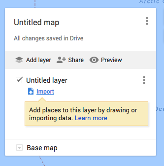
Go to the "Google Drive" tab and select the Sheet you made earlier.
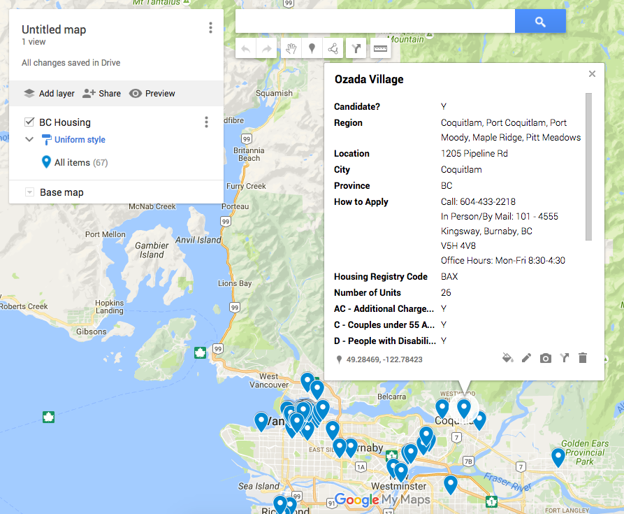
Now, it will ask you two questions. The first is to choose columns from where to get your location data. In my case, this is Location, City, and Province.
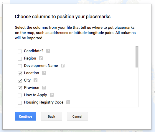
Next, it will ask which column to use as the name of the markers when they're clicked. In my case, I chose "Development Name."
And... boom! Just look at your perdy map! :D
Step #3: Getting all fan-say
So we have our visualization, and that's super. But it's still incredibly tedious to go through each marker and figure out which ones allow pets and which don't.
So instead, let's make the markers different colours (green/red), based on whether or not the place is a possible candidate.
To do this, I added a "Candidate?" column to the spreadsheet, with a simple algorithm:
=IF(O2 >= 1, "Y", "N")
In other words, if the "Number of Pets" column is at least 1, give this column a value of "Y". Otherwise, give it a value of "N".
You can also "nest" IF statements, like so, to mark only places that allow pets and also allow wheelchair access as candidates:
=IF(O2 >= 1, IF(L2 ="Y", IF(U2 = "Y", "Y", "N"), "N")
Repeat the nesting for each condition.
Once you have this column, you can do something kind of cool. (Btw, you'll need to delete and re-add the layer in Google Maps each time you update the source data... sad panda.)
In the upper left, click where it says "Uniform style" and change "Group places by" to your "Candidate?" column:
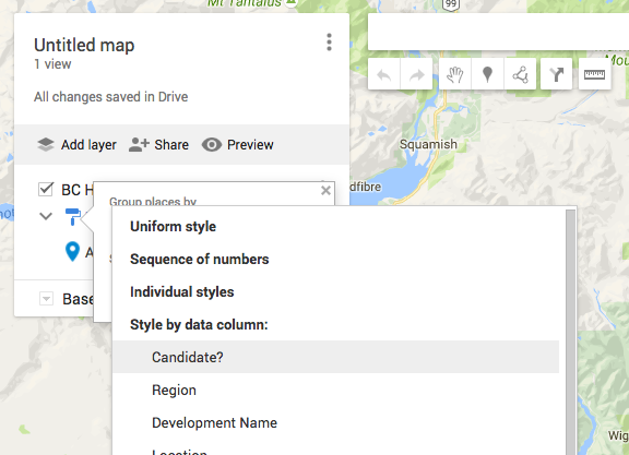
The two options will automatically be colour-coded according to whether they're "Y" or "N" (colour assignments are seemingly random, so you may need to tweak the colours so they're more obvious).
Now click "Preview" to check out your new, more awesomer perdy map! :D
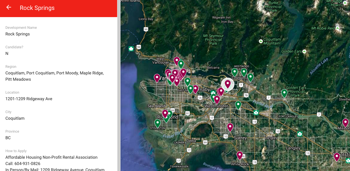
Yay! In (hopefully) only a few minutes of work, and using totally free (as in beer, sadly not as in freedom) tools, you can have your own data-driven Google Map. :) Yeehaw!